Build a Responsive Portfolio Project in React from scratch
Posted Dec 24, 2022
Welcome to the #react10 Day 10 challenge.
In this tutorial we will build a responsive Portfolio Project in React from scratch. This tutorial will teach you how you can develop your own modern 2023 ready personal portfolio website using reactjs, html & css.
The development process is simple and we won't do any API calls. Content/Text for this website will be hardcoded in your components.
NPM Packages
- react-toastify (for contact form submit success message)
- react-scroll (for navbar section scrolling)
- emailjs-com (for contact form email)
- @material-ui/icons (for icons)
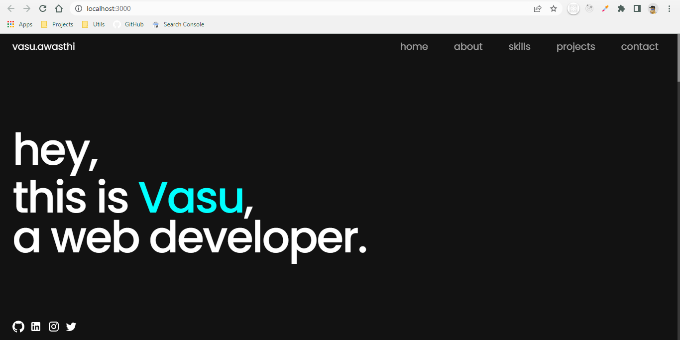
Demo
Responsive React Portfolio Github Code
Lets follow our basic configuration flow.
Pre-requisites
- Code Editor (like VS Code)
- React basic knowledge
- Basic knowledge of HTML & CSS
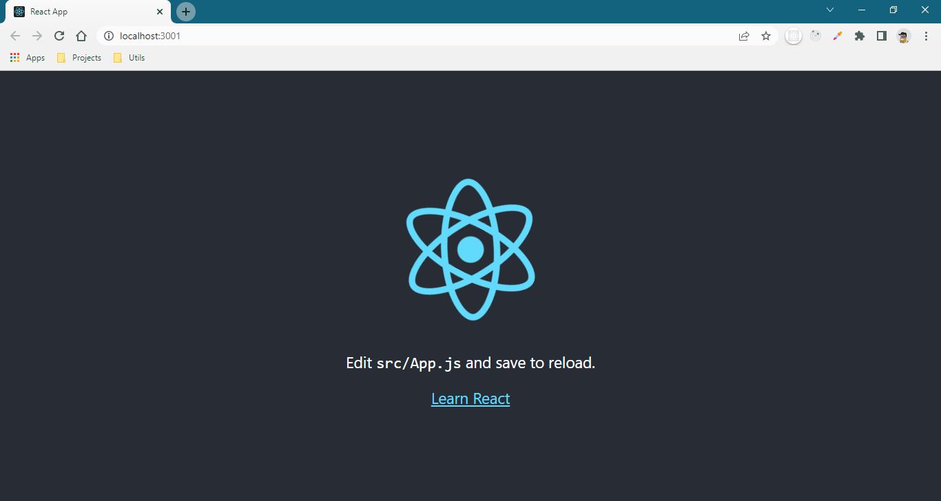
Lets Begin!
Open terminal in the vs code and run these commands,
npx create-react-app personal-portfolio
cd personal-portfolio
npm start
After doing all of this, your UI should look like,
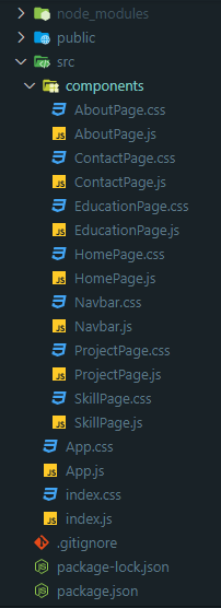
Folder Structure
- Follow the below images to create same folder structure along with the js and css files.
Note - I have removed few files which 'create-react-app' util gives us by default.
Lets code!
This project is very easy to develop and it does not have any complex logic, so I am putting code directly without any explanation.
1. index.css
* {
  font-family: "Poppins", sans-serif;
  margin: 0;
}

body {
  background-color: #121212;
  width: 100%;
}

textarea:focus,
input:focus {
  outline: none;
}

input {
  height: 30px;
}

input,
textarea,
button {
  border-radius: 5px;
  border: none;
  padding: 0px 10px;
}

textarea {
  padding: 10px;
}

button:hover {
  cursor: pointer;
}

a {
  text-decoration: none;
  color: inherit;
  cursor: pointer;
}

/* width */
::-webkit-scrollbar {
  width: 5px;
}

/* Track */
::-webkit-scrollbar-track {
  background: #383838;
}

/* Handle */
::-webkit-scrollbar-thumb {
  background: #888;
}

/* Handle on hover */
::-webkit-scrollbar-thumb:hover {
  background: #555;
}
2. App.js
import React, { useEffect, useState } from "react";
import ArrowUpwardIcon from "@material-ui/icons/ArrowUpward";
import "./App.css";
import AboutPage from "./components/AboutPage";
import ContactPage from "./components/ContactPage";
import HomePage from "./components/HomePage";
import ProjectPage from "./components/ProjectPage";
import SkillPage from "./components/SkillPage";
import EducationPage from "./components/EducationPage";

export default function App() {
  const [showBackToTopBtn, setShowBackToTopBtn] = useState(false);

  const toggleVisible = () => {
    const scrolled = document.documentElement.scrollTop;
    if (scrolled > 500) {
      setShowBackToTopBtn(true);
    } else if (scrolled <= 500) {
      setShowBackToTopBtn(false);
    }
  };

  useEffect(() => {
    window.addEventListener("scroll", toggleVisible);
  }, []);

  function scrollToTop() {
    window.scrollTo({
      top: 0,
      behavior: "smooth",
    });
  }
  return (
    <>
      <div className="app-section" id="home">
        <HomePage />
      </div>
      <div className="app-section" id="about">
        <AboutPage />
      </div>
      <div className="app-section" id="skills">
        <SkillPage />
      </div>
      <div className="app-section" id="projects">
        <ProjectPage />
      </div>
      <div className="app-section">
        <EducationPage />
      </div>
      <div className="app-section-contact" id="contact">
        <ContactPage />
      </div>
      {showBackToTopBtn && (
        <button className="btn-back-to-top" onClick={scrollToTop}>
          <span> Back to Top</span>
          <ArrowUpwardIcon />
        </button>
      )}
    </>
  );
}
3. App.css
:root {
  --heading-margin: 80px;
  --section-color: #00ffff;
  --section-heading-size: 5rem;
  --section-heading-size-mobile: 3.5rem;
  --section-sub-heading-size: 1.5rem;
  --section-grey-color: rgba(255, 255, 255, 0.6);
  --heading-letter-spacing: -3px;
}

@media only screen and (max-width: 800px) {
  .btn-back-to-top > span {
    display: none;
  }

  .btn-back-to-top {
    width: 30px !important;
  }
}

.app-section {
  padding: 0 25px;
  margin-bottom: var(--heading-margin);
}

.app-section-contact {
  min-height: 100vh !important;
  padding: 0 25px;
}

.btn-back-to-top {
  position: fixed;
  bottom: 25px;
  right: 25px;
  background-color: white;
  color: black;
  border-radius: 5px;
  display: flex;
  height: 30px;
  align-items: center;
  width: 120px;
  justify-content: center;
  font-weight: 500;
}

.btn-back-to-top > svg {
  font-size: 1.2rem;
}
4. HomePage.js
import React from "react";
import LinkedInIcon from "@material-ui/icons/LinkedIn";
import InstagramIcon from "@material-ui/icons/Instagram";
import TwitterIcon from "@material-ui/icons/Twitter";
import GitHubIcon from "@material-ui/icons/GitHub";
import "./HomePage.css";
import Navbar from "./Navbar";

const HomePage = () => {
  return (
    <div className="home-page-container">
      <div className="home-page-header">
        <Navbar />
      </div>
      <div className="home-page">
        <div>
          <span>hey,</span>
          <p>
            this is<span> Vasu</span>,
          </p>
        </div>
        <span>a web developer.</span>
      </div>
      <div className="home-page-footer">
        <a
          href="https://github.com/Vasu7389/react-project-ideas"
          target="_blank"
          rel="noopener noreferrer"
        >
          <GitHubIcon />
        </a>
        <a
          href="https://www.linkedin.com/in/vasu-awasthi-9a820b137"
          target="_blank"
          rel="noopener noreferrer"
        >
          <LinkedInIcon />
        </a>
        <a
          href="https://www.instagram.com/vasu.awasthi3/"
          target="_blank"
          rel="noopener noreferrer"
        >
          <InstagramIcon />
        </a>
        <a href="/">
          <TwitterIcon />
        </a>
      </div>
    </div>
  );
};

export default HomePage;
5. HomePage.css
@media only screen and (max-width: 800px) {
  .home-page {
    font-size: 3.5rem !important;
    line-height: 3.3rem !important;
    font-weight: 500 !important;
  }
  .home-page-footer {
    margin-bottom: 4.5rem !important;
  }

  .home-page > div > span {
    line-height: 65px !important;
  }
}

.home-page-container {
  min-height: 100vh;
  width: 100%;
  color: white;
  display: flex;
  flex-direction: column;
  justify-content: space-between;
}

.home-page-header {
  height: 50px;
  display: flex;
  align-items: center;
}

.home-page {
  display: flex;
  justify-content: center;
  align-items: flex-start;
  flex-direction: column;
  font-size: 5.5rem;
  font-weight: 500;
  position: relative;
  line-height: 80px;
  letter-spacing: var(--heading-letter-spacing);
  position: relative;
}

.home-page > div > p > span {
  color: var(--section-color);
}

.home-page > div > span {
  line-height: 7rem;
}

.home-page-footer {
  width: 130px;
  display: flex;
  justify-content: space-between;
  margin-bottom: 25px;
}
6. AboutPage.js
import React from "react";
import "./AboutPage.css";

const AboutPage = () => {
  return (
    <div className="about-container">
      <div className="about-header">
        ab<span>out</span>
      </div>
      <div className="about-info">
        <div className="about-left">
          I love to create something simple and clean using javascript with html
          and css.
        </div>
        <div className="about-right">
          <p>
            I'm Vasu Awasthi. I am a <span>Software Developer</span>. I have
            done Post Graduate Diploma in Advanced Computing from{" "}
            <span>CDAC</span>, Bangalore.
          </p>
          <p>
            I specialize in efficient <span>React</span> apps and
            <span> CSS</span> & <span>HTML</span> that just work across all platforms
            and browsers. I care deeply about building interfaces that are usable
            and pleasant for the most number of people possible.
          </p>
          <p>
            Right now, I’m excited about improving skill on writing automated
            <span> test cases</span> and becoming a <span>React senior</span>.
          </p>
        </div>
      </div>
    </div>
  );
};

export default AboutPage;
7. AboutPage.css
@media only screen and (max-width: 800px) {
  .about-info {
    flex-direction: column;
  }
  .about-header {
    font-size: var(--section-heading-size-mobile) !important;
  }
  .about-left,
  .about-right {
    width: 100% !important;
  }
  .about-left {
    margin-bottom: 50px;
  }
}

.about-container {
  color: white;
  display: flex;
  flex-direction: column;
}

.about-header {
  font-size: var(--section-heading-size);
  letter-spacing: var(--heading-letter-spacing);
}

.about-header > span {
  color: var(--section-color);
}

.about-info {
  display: flex;
  justify-content: space-between;
  margin-top: 30px;
}

.about-left {
  width: 50%;
  font-size: var(--section-sub-heading-size) !important;
}

.about-right {
  width: 40%;
  font-weight: 400;
  display: flex;
  justify-content: space-between;
  flex-direction: column;
  color: var(--section-grey-color);
}

.about-right > p {
  margin-bottom: 20px;
}

.about-right > p > span {
  color: white;
  font-weight: 700;
}
8. Navbar.js
import React, { useState } from "react";
import { Link } from "react-scroll";
import MenuIcon from "@material-ui/icons/Menu";
import CloseIcon from "@material-ui/icons/Close";
import "./Navbar.css";

const Navbar = () => {
  const [isMenuOpen, setIsMenuOpen] = useState(false);
  return (
    <div className="navbar-container">
      <div className="navbar-left">
        <Link to="home" spy={true} smooth={true} duration={500}>
          vasu.awasthi
        </Link>
      </div>
      <div className="navbar-right-menubar">
        {isMenuOpen ? (
          <div className="navbar-menu-options">
            <CloseIcon onClick={() => setIsMenuOpen(!isMenuOpen)} />
            <Link
              onClick={() => setIsMenuOpen(!isMenuOpen)}
              to="home"
              spy={true}
              smooth={true}
              duration={500}
            >
              home
            </Link>
            <Link
              onClick={() => setIsMenuOpen(!isMenuOpen)}
              to="about"
              spy={true}
              smooth={true}
              duration={500}
            >
              about
            </Link>
            <Link
              onClick={() => setIsMenuOpen(!isMenuOpen)}
              to="skills"
              spy={true}
              smooth={true}
              duration={500}
            >
              skills
            </Link>
            <Link
              onClick={() => setIsMenuOpen(!isMenuOpen)}
              to="projects"
              spy={true}
              smooth={true}
              duration={500}
            >
              projects
            </Link>
            <Link
              onClick={() => setIsMenuOpen(!isMenuOpen)}
              to="contact"
              spy={true}
              smooth={true}
              duration={500}
            >
              contact
            </Link>
          </div>
        ) : (
          <MenuIcon onClick={() => setIsMenuOpen(!isMenuOpen)} />
        )}
      </div>
      <div className="navbar-right-options">
        <Link to="home" spy={true} smooth={true} duration={500}>
          home
        </Link>
        <Link to="about" spy={true} smooth={true} duration={500}>
          about
        </Link>
        <Link to="skills" spy={true} smooth={true} duration={500}>
          skills
        </Link>
        <Link to="projects" spy={true} smooth={true} duration={500}>
          projects
        </Link>
        <Link to="contact" spy={true} smooth={true} duration={500}>
          contact
        </Link>
      </div>
    </div>
  );
};

export default Navbar;
9. Navbar.css
@media only screen and (max-width: 800px) {
  .navbar-right-options {
    display: none !important;
  }
  .navbar-right-menubar {
    display: block !important;
  }
  .navbar-container {
    position: inherit !important;
    width: 100%;
  }
}

.navbar-container {
  color: white;
  width: 95vw;
  display: flex;
  justify-content: space-between;
  font-size: 1.2rem;
  position: fixed;
}

.navbar-left {
  width: 30%;
}

.navbar-left > a {
  justify-content: flex-start;
}

.navbar-right-options {
  color: var(--section-grey-color);
  width: 40%;
  display: flex;
  justify-content: space-between;
}

.navbar-right-options > a:hover {
  color: var(--section-color) !important;
}

.navbar-right-menubar {
  display: none;
}

.navbar-menu-options {
  display: flex;
  justify-content: space-around;
  font-size: 2rem;
  align-items: center;
  flex-direction: column;
  position: fixed;
  top: 0%;
  right: 0%;
  width: 100vw;
  height: 85vh;
  background-color: #121212;
  z-index: 1;
}

.navbar-menu-options > svg {
  font-size: 3rem;
}
10. SkillPage.js
import React from "react";
import "./SkillPage.css";

const SkillPage = () => {
  return (
    <div className="skill-container">
      <div className="skill-left">
        <div className="skill-header">
          <span>ski</span>lls
        </div>
        <p>
          It is possible to fly without motors, but not without knowledge and
          skill.
        </p>
      </div>
      <div className="skill-right">
        <div id="myCanvasContainer">
          <canvas width="600" height="600" id="myCanvas"></canvas>
        </div>
        <div id="tags">
          <ul>
            <li>
              <a href="/skills">javascript</a>
            </li>
            <li>
              <a href="/skills">react</a>
            </li>
            <li>
              <a href="/skills">html</a>
            </li>
            <li>
              <a href="/skills">css</a>
            </li>
            <li>
              <a href="/skills">redux</a>
            </li>
            <li>
              <a href="/skills">github</a>
            </li>
            <li>
              <a href="/skills">vs code</a>
            </li>
            <li>
              <a href="/skills">website</a>
            </li>
            <li>
              <a href="/skills">cypress</a>
            </li>
            <li>
              <a href="/skills">jest</a>
            </li>
            <li>
              <a href="/skills">javascript</a>
            </li>
            <li>
              <a href="/skills">react-routing</a>
            </li>
            <li>
              <a href="/skills">react</a>
            </li>
            <li>
              <a href="/skills">es6+</a>
            </li>
            <li>
              <a href="/skills">javascript</a>
            </li>
            <li>
              <a href="/skills">react</a>
            </li>
            <li>
              <a href="/skills">html</a>
            </li>
            <li>
              <a href="/skills">css</a>
            </li>
            <li>
              <a href="/skills">redux</a>
            </li>
            <li>
              <a href="/skills">github</a>
            </li>
            <li>
              <a href="/skills">vs code</a>
            </li>
            <li>
              <a href="/skills">website</a>
            </li>
            <li>
              <a href="/skills">cypress</a>
            </li>
            <li>
              <a href="/skills">jest</a>
            </li>
            <li>
              <a href="/skills">javascript</a>
            </li>
            <li>
              <a href="/skills">react</a>
            </li>
            <li>
              <a href="/skills">es6+</a>
            </li>
          </ul>
        </div>
      </div>
    </div>
  );
};

export default SkillPage;
11. SkillPage.css
@media only screen and (max-width: 800px) {
  .skill-header {
    font-size: var(--section-heading-size-mobile) !important;
  }
  .skill-container {
    flex-direction: column;
  }
  #myCanvasContainer > canvas {
    width: 100% !important;
    height: 40vh !important;
  }
  .skill-right,
  .skill-left {
    width: 100% !important;
  }
  .skill-left > p {
    margin-bottom: 50px;
  }
}

.skill-container {
  color: white;
  display: flex;
}

.skill-header {
  font-size: var(--section-heading-size);
  margin-bottom: 30px;
  letter-spacing: var(--heading-letter-spacing);
}

.skill-header > span {
  color: var(--section-color);
}

.skill-right {
  opacity: 0.8;
  color: white;
  width: 40%;
}

.skill-left {
  width: 50%;
  font-size: var(--section-sub-heading-size) !important;
  display: flex;
  flex-direction: column;
  justify-content: flex-start;
  align-items: flex-start;
}
12. ProjectPage.js
import React from "react";
import "./ProjectPage.css";

const ProjectPage = () => {
  return (
    <div className="project-container">
      <div className="project-header">
        <span>pro</span>jects
      </div>
      <div className="project-list">
        <div className="project">
          <p>E-commerce</p>
          <p>Shoppinn</p>
          <p>
            <span>2022</span>
            <a href="https://www.codinn.dev/article/ecommerce-website-in-reactjs">
              Tap to view
            </a>
          </p>
        </div>
        <div className="project">
          <p>Clock</p>
          <p>Stopwatch & Counter</p>
          <p>
            <span>2022</span>
            <a href="https://www.codinn.dev/article/stopwatch-timer-in-reactjs">
              Tap to view
            </a>
          </p>
        </div>
        <div className="project">
          <p>Game</p>
          <p>Snake Game</p>
          <p>
            <span>2020</span>
            <a href="https://www.codinn.dev/article/snake-game-in-reactjs">
              Tap to view
            </a>
          </p>
        </div>
      </div>
    </div>
  );
};

export default ProjectPage;
13. ProjectPage.css
@media only screen and (max-width: 800px) {
  .project-header {
    font-size: var(--section-heading-size-mobile) !important;
  }
  .project-header > p > span {
    font-size: 4.5rem !important;
  }
}

.project-container {
  color: white;
  display: flex;
  flex-direction: column;
}

.project-header {
  font-size: var(--section-heading-size);
  letter-spacing: var(--heading-letter-spacing);
}

.project-header > span {
  color: var(--section-color);
}

.project {
  display: flex;
  flex-direction: column;
  justify-content: space-between;
  align-items: flex-start;
  margin: 30px 0px;
}

.project > p:nth-child(1) {
  font-size: 0.9rem;
  color: var(--section-grey-color);
}

.project > p:nth-child(2) {
  font-size: var(--section-sub-heading-size) !important;
  padding: 15px 0px;
}

.project > p:nth-child(3) {
  display: flex;
  justify-content: space-between;
  width: 100%;
  font-size: 0.9rem;
  color: var(--section-grey-color);
  padding: 5px 0px;
  border-bottom: 1px solid rgb(87, 86, 86);
}

.project > p:nth-child(3) > a {
  text-decoration: none;
}

a {
  display: flex;
  justify-content: center;
}
14. EducationPage.js
import React from "react";
import LocationOnIcon from "@material-ui/icons/LocationOn";
import "./EducationPage.css";

const EducationPage = () => {
  return (
    <div className="education-container">
      <div className="education-header">
        <p>experience</p>
        <p>
          <span>&</span>education
        </p>
      </div>
      <div className="education-list">
        <div className="education">
          <p>Software Developer</p>
          <p>codinn.dev</p>
          <p>
            <span>Sept'19 - Present</span>
            <a href="/">
              <LocationOnIcon />
              Bangalore, India
            </a>
          </p>
        </div>
        <div className="education">
          <p>Post Gradute Diploma</p>
          <p>Center for Development of Advanced Computing</p>
          <p>
            <span>Feb'19 - Aug'19</span>
            <a href="/">
              <LocationOnIcon />
              Bangalore, India
            </a>
          </p>
        </div>
        <div className="education">
          <p>Bachelors of Engineering</p>
          <p>ABC College of XYZ</p>
          <p>
            <span>July'14 - June'18</span>
            <a href="/">
              <LocationOnIcon />
              Pune, India
            </a>
          </p>
        </div>
        <div className="education">
          <p>Higher Secondary Education</p>
          <p>Kendriya Vidyalaya VFJ School</p>
          <p>
            <span>April'13 - March'14</span>
            <a href="/">
              <LocationOnIcon />
              Delhi, India
            </a>
          </p>
        </div>
      </div>
    </div>
  );
};

export default EducationPage;
15. EducationPage.css
@media only screen and (max-width: 800px) {
  .education-header {
    font-size: var(--section-heading-size-mobile) !important;
    line-height: 3rem !important;
  }
  .education-header > p > span {
    font-size: 4.5rem !important;
  }
}

.education-container {
  color: white;
  display: flex;
  flex-direction: column;
}

.education-header {
  font-size: var(--section-heading-size);
  line-height: 5rem;
  letter-spacing: var(--heading-letter-spacing);
}

.education-header > p > span {
  font-size: 7rem;
  font-family: initial;
  color: var(--section-color);
}

.education {
  display: flex;
  flex-direction: column;
  justify-content: space-between;
  align-items: flex-start;
  margin: 30px 0px;
}

.education > p:nth-child(1) {
  font-size: 0.9rem;
  color: var(--section-grey-color);
}

.education > p:nth-child(2) {
  font-size: var(--section-sub-heading-size) !important;
  line-height: 1.8rem;
  padding: 15px 0px;
}

.education > p:nth-child(3) {
  display: flex;
  justify-content: space-between;
  width: 100%;
  font-size: 0.9rem;
  border-bottom: 1px solid rgb(87, 86, 86);
  padding: 5px 0px;
  color: var(--section-grey-color);
}

.education > p:nth-child(3) > a {
  text-decoration: none;
}

a {
  display: flex;
  justify-content: center;
}
16. ContactPage.js
import React, { useState } from "react";
import { send } from "emailjs-com";
import { ToastContainer, toast } from "react-toastify";
import "react-toastify/dist/ReactToastify.css";
import "./ContactPage.css";
const jokeList = [
"Why did the developer go broke? Because he used up all his cache.",
"Why do I drink coffee? It always me to do stupid things faster and with more energy.",
"A conference call is the best way to get a dozen people to say bye 300 times.",
"How does NASA organize a party? They planet.",
"You know what they say about a clean desk. It’s a sure sign of a cluttered desk drawer.",
"What did one ocean say to the other? Nothing, they just waved.",
"Why did the can crusher quit his job? Because it was soda pressing.",
"Whoever stole my copy of Microsoft Office, I will find you! You have my word!",
"What did the full glass say to the empty glass? “You look drunk.”",
"Who wins in a fight between Sunday and Monday? Sunday. Monday is a weekday.",
];
const ContactPage = () => {
// eslint-disable-next-line no-unused-vars
const [joke, setJoke] = useState(
jokeList[Math.floor(Math.random() * jokeList.length)]
);
const [name, setName] = useState();
const [email, setEmail] = useState();
const [subject, setSubject] = useState();
const [message, setMessage] = useState();
const onFormSubmit = (event) => {
event.preventDefault();
console.log(name, email, subject, message);
send(
process.env.REACT_APP_SERVICE_ID,
process.env.REACT_APP_TEMPLATE_ID,
{
from_name: name,
to_name: "Vasu",
message: { message, email, subject },
reply_to: "",
},
process.env.REACT_APP_USER_ID
)
.then((response) => {
setName("");
setEmail("");
setMessage("");
setSubject("");
toast.success("Message sent successfully!", {
position: "top-right",
autoClose: 3000,
hideProgressBar: false,
closeOnClick: true,
pauseOnHover: true,
draggable: true,
progress: undefined,
});
})
.catch((err) => {
toast.error("Message failed to send, please try again later.", {
position: "top-right",
autoClose: 3000,
hideProgressBar: false,
closeOnClick: true,
pauseOnHover: true,
draggable: true,
progress: undefined,
});
});
};
return (
<div className="contact-container">
<ToastContainer
position="top-right"
autoClose={3000}
hideProgressBar={false}
newestOnTop
closeOnClick
rtl={false}
pauseOnFocusLoss
draggable
pauseOnHover
/>
<div className="contact-header">contact</div>
<div className="contact-info">
<div className="contact-left">
<span>{joke}</span>😆
</div>
<div className="contact-right">
<form className="contact-form" onSubmit={onFormSubmit}>
<div className="contact-form-row">
<div className="contact-form-group">
<label htmlFor="name">Name</label>
<input
type="text"
name="name"
id="name"
value={name}
onChange={(e) => setName(e.target.value)}
/>
</div>
<div className="contact-form-group">
<label htmlFor="email">E-mail</label>
<input
type="email"
name="email"
id="email"
value={email}
onChange={(e) => setEmail(e.target.value)}
/>
</div>
</div>
<div className="contact-form-group">
<label htmlFor="subject">Subject</label>
<input
type="text"
name="subject"
id="subject"
value={subject}
onChange={(e) => setSubject(e.target.value)}
/>
</div>
<div className="contact-form-group">
<label htmlFor="message">Message</label>
<textarea
className="contact-form-message"
type="text"
name="message"
id="message"
value={message}
onChange={(e) => setMessage(e.target.value)}
/>
</div>
<button className="contact-form-button" type="submit">
Send
</button>
</form>
</div>
</div>
</div>
);
};
export default ContactPage;
17. ContactPage.css
@media only screen and (max-width: 800px) {
  .contact-header {
    font-size: var(--section-heading-size-mobile) !important;
  }
  .contact-info {
    flex-direction: column;
  }

  .contact-left,
  .contact-right {
    width: 100% !important;
    margin-bottom: 30px;
  }
}

.contact-container {
  color: white;
  display: flex;
  flex-direction: column;
}

.contact-header {
  font-size: var(--section-heading-size);
  letter-spacing: var(--heading-letter-spacing);
}

.contact-info {
  display: flex;
  justify-content: space-between;
  margin-top: 30px;
}

.contact-left {
  width: 40%;
  font-size: 1.1rem;
}

.contact-left > span {
  color: var(--section-grey-color);
  font-style: italic;
}

.contact-right {
  width: 50%;
  font-weight: 400;
  display: flex;
  justify-content: space-between;
  flex-direction: column;
  height: 370px;
}

.contact-form {
  display: flex;
  flex-direction: column;
  justify-content: space-between;
  height: 100%;
  font-weight: 500;
}

.contact-form-row {
  display: flex;
  justify-content: space-between;
}

.contact-form-row > div {
  width: 47%;
}

.contact-form-message {
  height: 150px;
}

.contact-form-group {
  display: flex;
  flex-direction: column;
}

.contact-form-button {
  width: 70px;
  height: 30px;
  font-weight: 500;
}
That's it! You have built a Responsive Portfolio Project in React from scratch. You can change the content or styling in your own way.
Final UI